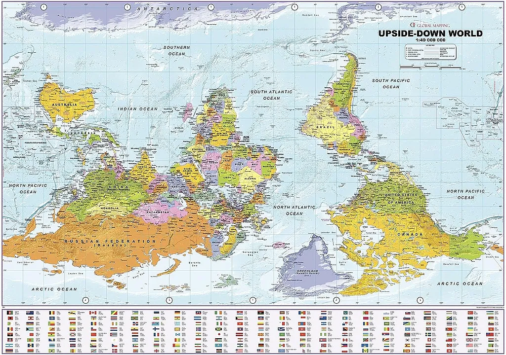
“What’s up? South!” – The World Map Upside Down by ODT Maps
Have you ever wondered what the world would look like with the southern hemisphere up? This intriguing idea offers more than a cartographic novelty; it’s an invitation to reconsider entrenched norms, unlearn biases, and journey towards a richer understanding of our globe. Inverting the conventional world map is not merely about changing directions but shifting perspectives on culture, economy, and psychology for a deeper grasp of our captivating planet.
In this article, we will investigate the fascinating idea of an upside-down world map, such as the “What’s up? South!” map by ODT, Inc., and other exciting examples of an inverted map of the world.
Turning the World Upside Down: A Challenge to Conventional Mapmaking
Venture into the enthralling domain of cartography, and you’ll quickly realize that maps are no mere sketches of land and sea. They act as silent whisperers of tales beyond geographical boundaries, subtly shaping our perception of culture, history, economy, and psychology. One particularly intriguing aspect is our unanimous decision to place ‘North’ as ‘up’ on maps – a practice so deeply rooted that it’s become second nature. But what if we told you that this conventional approach to mapping has been put on trial, challenging our ingrained perceptions and inviting us to broaden our global understanding?
Imagine the world as a sphere – which it truly is – and there is no inherent ‘up’ or ‘down’. Despite this, we’ve collectively agreed upon a north-up convention for our maps. This widely accepted norm not only shapes our geographical understanding but also wields an understated influence over our cultural, political, and economic worldviews.
In the world of cartography, however, this customary perspective has encountered some spirited challengers. A league of innovative mapmakers is daring to flip the Earth on its head, creating “upside-down” or “south-up” style world maps that overthrow the traditional Earth’s layout and inject a breath of fresh air into our global perspective.
McArthur’s Universal Corrective Map of the World
Stuart McArthur’s Universal Corrective Map of the World, first published in 1979, is a famous “upside down” view of the world, where the South is at the top and the North is at the bottom. It’s considered a corrective map because it attempts to challenge the traditional Euro-centric bias often occurring in world map depictions.
Nearly all conventional world maps, including the widely used Mercator projection, place the Northern Hemisphere at the top, which could suggest a sense of superiority or importance. The Mercator projection also distorts the size of landmasses according to their distance from the equator. This results in regions like Africa and South America appearing smaller relative to their true size, while North America, Europe, and particularly Greenland appear larger. This has historically reinforced a perception of European (or, more broadly, Northern) dominance.
Stuart McArthur, an Australian, produced the Universal Corrective Map to challenge these preconceptions. It presents an alternative perspective that is no less accurate geographically but culturally and ideologically disruptive to the status quo. In McArthur’s South-up map orientation, Australia is prominently displayed at the top center of the world map.
The map is a powerful reminder that the conventions we take for granted, like “North is up,” are not based on any inherent truth but are simply human constructs. It urges viewers to question their assumptions and view the world from different perspectives. However, like all flat maps of our spherical Earth, it still has distortions in size and shape, a challenge that all cartographers face when creating two-dimensional representations of our three-dimensional world.

Upside Down Map by ODT
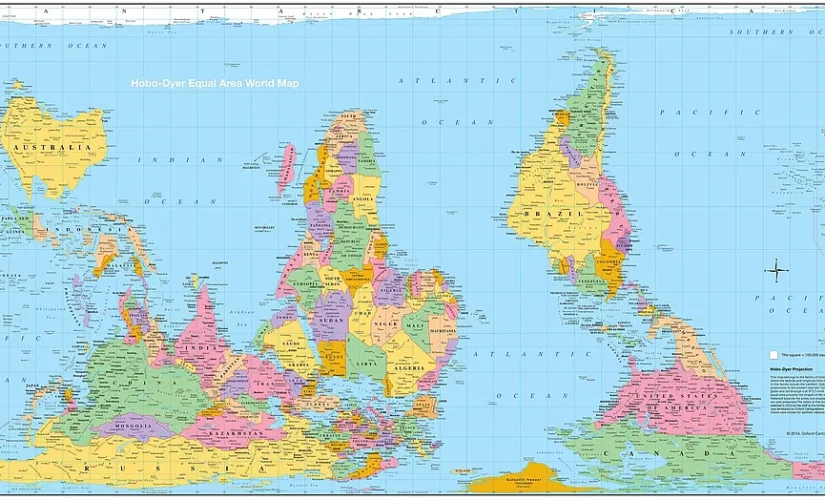
Also, consider the refreshingly different map “What’s Up? South!” brought to life by ODT, Inc., which also made the Hobo-Dyer map and the Peters Projection Map. It nudges the viewers to shrug off their preconceived notions and experience the world from an unconventional vantage point. All the continents and countries you’ve known and loved are right there, only slightly … upturned. South America floats above North America, Africa sits atop Europe, and Australia nestles comfortably at the top left instead of the bottom right corner. The map unsettles the physical placement of countries and questions the age-old Eurocentric thought that places the Northern Hemisphere as the world’s centerpiece.
Witnessing this unfamiliar view sparks an interesting inner dialogue about the arbitrariness of our accepted norms. As a floating sphere, our world doesn’t naturally have a ‘top’. We could approach it from any angle, yet this fundamental truth is often forgotten. The map shakes us awake, compelling us to question our deep-seated assumptions in every facet of life.
From this unusual perspective, we soon realize how our outlook is modeled by the maps we’ve grown up with. It drives home the realization that no single map can fully capture our planet’s vast diversity and abundance. Each map is but a snapshot, a single perspective, and should we insist on one viewpoint, we risk overlooking the world’s vastness.
In daring to challenge our notions of ‘normal’ and ‘right,’ the “What’s Up? South!” map expands our horizon. It compels us to reflect on the consequences of our chosen perspectives and appreciate the potency of alternate viewpoints. As with maps, our lives can be enriched through a symphony of diverse perspectives.
Maps and Mindsets: Decoding the North-South Bias
It becomes evident that maps are not just navigational aids. They are transformative educational and ideological instruments shaping our understanding of the world. They coax us into perceiving and deciphering the world in new, distinctive ways. By defying conventional norms, maps like “What’s Up? South!” nudge us toward the boundless perspectives available for exploring and understanding our planet. It’s not merely about shifting our Earthly viewpoint but recognizing how such a shift can profoundly alter our global understanding.
Cartographic representation extends beyond geographic details to encompass cultural and psychological inferences. Our collective alignment of North and South on maps contributes to a distinct psychological effect known as the “north-south bias”. ‘North’ on a map is subconsciously linked with wealth and prosperity, while ‘South’ is associated with relative poverty and lower status. Yet, it’s fascinating how this ingrained bias appears to fade when viewers are presented with south-up maps.
This bias springs from two intertwined roots. First is the long-held tradition of placing the North at the top of maps. Second is a broader cultural correlation between vertical positioning and judgments of good and bad, with ‘up’ often signifying ‘good’ and ‘down’ symbolizing ‘bad’. This bias isn’t confined to geography – it permeates various facets of life, coloring our perceptions of power dynamics, financial evaluations, emotional states, and even religious contexts.
Common English idioms reinforce this bias. Phrases like “heading up north” or “down south”, and even the colloquial term for Australia, “Down Under”, indicate the prevalent association of ‘north’ with ‘up’ and ‘south’ with ‘down’. This association isn’t a natural phenomenon but a learned one derived from constant exposure to the prevailing north-up map orientation convention.
This deep-seated “north-south bias” bleeds into our popular culture, resonating in song lyrics and fortifying wealth-related stereotypes. The term “Uptown” is often indicative of affluence, while “Downtown” frequently represents a lower socioeconomic status.
Conclusion: The World Beyond North and South
The “South-up” perspective, as exemplified by McArthur’s Universal Corrective Map of the World and the “What’s Up? South!” map, disrupts traditional map layouts and reshapes worldviews. Its purpose extends beyond simply presenting an unconventional orientation. It underscores how cartographic conventions influence societal perceptions and biases, inviting a thorough reassessment of the established norms. This new perspective unravels an intriguing truth: Our world’s orientation is not a fact but a convention.
By revealing and challenging the pervasive “north-south bias”, it enables a more balanced global understanding and encourages the welcoming of diverse viewpoints. As we delve into questioning, exploration, and open-mindedness, we gain profound insights into our mesmerizing planet. Ultimately, the question evolves from “What’s up, South?” to a broader, more significant one: “What else have we yet to discover?” The world, like our viewpoints, is a dynamic sphere with limitless possibilities.
If you want to view the world from a fresh perspective, different from what most world maps offer, check out some south-up maps!
Related Posts