World Population Map by ODT: Displaying the World’s People
In 2015, ODT, Inc. introduced an innovative tool for learning and understanding world populations – the “World Population Map”. Relying on projections from the U.S. State Department, the map renders an exciting visual experience. It compellingly transcribes numbers into visuals, providing a more tangible grasp of the global populace. Each grid square on the map embodies one million people, making it simple to gauge the relative population size of each country.
Shifting the Focus: From Landmass to Population
The map unfolds a unique perspective, where countries are shown proportionate to their population rather than their geographical territory. It highlights how China, from a population standpoint, stands as the largest country, followed closely by India. (Note that in 2023, India passed China and now has the largest population of all countries on our planet.) The map also enables intriguing comparisons, such as between Indonesia and the United States, revealing that the USA accommodates less than 4.5% of the Earth’s humans, a fraction below one-twentieth.
Population Development Over Time
The “World Population Map” is not confined to the present; it incorporates historical and projected population data, offering a snapshot of our species’ spread across time. It displays population by continent throughout human history, including significant milestones such as 100,000 years ago, the time of Christ’s birth, 1650 AD, and 1900 AD. Moreover, it daringly gazes into the future, providing population projections for the year 2150.
An addition to the latest edition of the map is a seventh thumbnail panel, which showcases the percentages of children under 15 years old, a demographic seen as the most robust predictor of future population growth. Alongside this, a population density map featuring regions with more than 30 people per square mile emphasizes the ‘continents and islands of humankind’ as opposed to conventional landmasses.

A few years ago, Population Education published a free and comprehensive lesson plan based on ODT’s population map. You can download it here.
Fairness and Equality as Core Principles
ODT, Inc.’s unique portrayal of the world’s populace was made possible by a diverse team of cartographers, population experts, graphic designers, GIS specialists, human rights advocates, HR professionals, and political activists. It acknowledges the existence of disputed territories like Tibet despite a lack of UN recognition, representing it as a distinct region. It also highlights the three million individuals residing in the Gaza Strip and the West Bank.
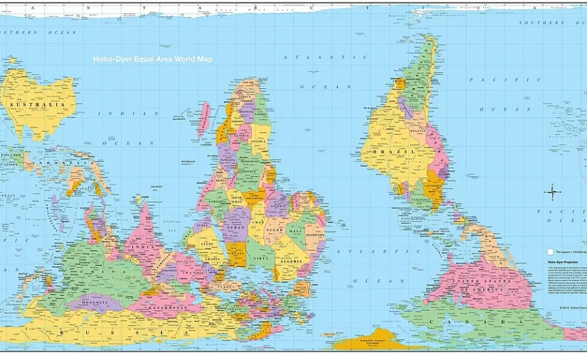
The World Population Map utilizes the Hobo-Dyer equal area projection, enabling the reader to juxtapose the land with the people, their locations, and the population trends across human history. This map is not merely a visual tool but an instrument of fairness, treating everyone equally regardless of location. By transposing numbers into graphics, it provides an insightful visual narrative of where the people truly are.
More Innovative Products from ODT
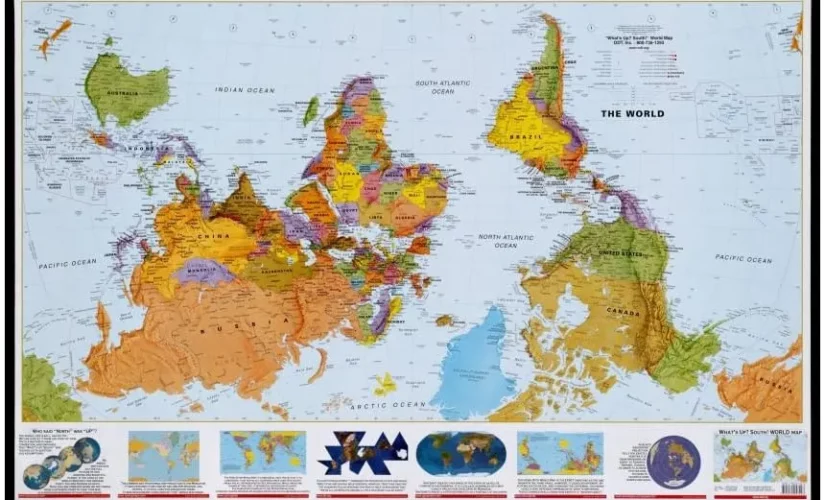
Apart from the World Population Map, ODT, Inc. published several other innovative geography resources, provoking a change in perspective. Among these were the Peters Projection map and the Hobo-Dyer map as equal-area world maps, as well as an upside-down world map with the South up. But the company also went into multimedia by producing the book “Seeing Through Maps” accompanied by the DVD “Many Ways to See the World“. While ODT ceased its operations in 2021, some of its groundbreaking products are still available for purchase.
Related Posts