The Peters Projection Map: An Equal Area World Map
In the history of cartography, a large variety of map projections have been developed to give us a visual representation of our planet. However, these representations are imperfect due to the inherent challenges of projecting a spherical globe onto a flat surface. In this article, we take a closer look at one particular map that has sparked a significant debate: the Peters Projection map.
Arno Peters and His Vision
Dr. Arno Peters was not just a German historian and cartographer but a polymath deeply engaged in an array of social, political, and historical issues. Born in 1916, his interests were not limited to geography; he was also an established filmmaker and held a doctorate in history. Peters was deeply conscious of the way different forms of media could shape public perception and inform worldviews. This sensitivity was an instrumental driving force behind the creation of the Peters Projection map.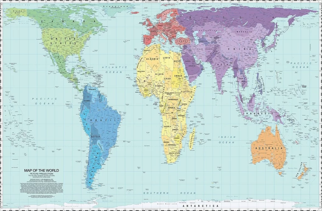
With a keen eye on the interconnectedness of world politics, economics, and history, Peters understood the impact that visual representations could have on shaping global perspectives. He felt that the prevalent world maps of the time, especially the Mercator projection, were more than just cartographic tools; they were potent symbols that carried subtle yet powerful messages about the world. He argued that the Mercator map, due to its distortion of the size of countries, could perpetuate and reinforce an unbalanced perception of the world, promoting a Eurocentric view and underrepresenting the Global South.
Driven by a desire to provide a more impartial and just portrayal of the world, Arno Peters set out on an ambitious endeavor. He aimed to create a map that corrected the discrepancies he saw in the traditional Mercator projection, which he perceived as carrying an embedded colonialist bias. This led him to the development of his eponymous map projection, the Peters Projection, premised on a pivotal idea: maintaining area accuracy.
ODT, Inc. made the following film portrait of Arno Peters and his work. It is free for home viewing but can also be purchased as a DVD for commercial or institutional use.
From Gall to Peters: A Different Perspective of the World
Arno Peters’ endeavor was not born in isolation; it was heavily influenced by a similar project dating back to the 19th century by James Gall, a Scottish clergyman and amateur cartographer. Gall had initially proposed a cylindrical equal-area projection in 1855, which was presented to the British Association for the Advancement of Science. Gall’s projection maintained the same focus on area accuracy as Peters’, creating a proportional depiction of landmasses but, like all such maps, did not perfectly preserve shapes or distances. However, despite its innovative approach, Gall’s projection gained little traction during his lifetime.
Fast forward to 1967, Arno Peters independently developed a map that used the same mathematical projection as Gall. He promoted it with an enthusiasm and a sense of social justice, drawing attention to its capacity to counteract the Eurocentric bias in most traditional world maps. He fervently advocated for his map to be used in educational settings and by the media to foster a more egalitarian and balanced understanding of the world’s geography.
The similarities between the map projections of Peters and Gall are why we often refer to the Peters Projection as the Gall-Peters Projection. Despite Gall having first developed the concept, it was Peters who successfully popularized it, shedding light on the importance of fair geographical representation. Today, their combined efforts stand as a testament to the power of cartography in shaping our understanding of the world and its intricate geographical relationships.
Peters vs. Mercator: Comparing Two Map Projections
The Peters and Mercator projections fundamentally differ in how they distort the world when translating it from a spherical to a flat surface.
The Mercator projection, developed in 1569 by Gerardus Mercator, was primarily designed for navigation. It preserves angles and shapes around any point, which is useful for course-plotting but causes size distortion. This means that the further you move from the equator, the more the sizes of countries are exaggerated. Consequently, countries like Greenland and Canada appear much larger relative to countries nearer the equator.
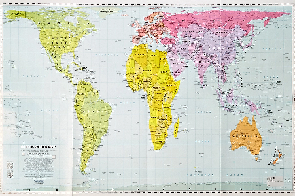
On the other hand, the Peters Projection preserves area at the expense of shape. This means that while the sizes of countries and continents are represented proportionally to their true areas, their shapes can be significantly distorted. For instance, countries closer to the poles, such as Canada and Russia, appear more stretched vertically than in reality, while those near the Equator appear more compressed horizontally. Despite the shape distortion, the accurate representation of relative areas provides a fresh perspective on the world’s geography, emphasizing the size and importance of regions often marginalized on other maps.
Unveiling the Peters Projection: An Equal-Area Map
The Peters Projection Map, as a cylindrical equal-area projection, carries the distinct purpose of ensuring parity in size representation across all regions of the Earth. This commitment to equal-area representation is rooted in mathematical precision. Essentially, “equal area” means that a given quantity of square miles on the ground translates into the same number of square units on the map, regardless of where that piece of ground is located.
While other map projections also provide equal-area representations, what sets the Peters Projection apart is its cylindrical nature, resulting in a rectangular world map. This allows it to maintain a straightforward north-south and east-west alignment, which is easier for general use compared to some other equal-area projections that may have more complex shapes or orientations.
A central feature of the Peters Projection is its capacity to correct some specific distortions that characterize the Mercator projection. On a Mercator map, countries nearer to the equator – regions that are, incidentally, often home to poorer, less developed nations – are depicted as smaller than their actual size. This cartographic diminishment can influence perceptions about these countries, diminishing their geographical significance and, potentially, their global importance.
In the Peters Projection, this issue is squarely addressed. Continents and countries are shown with an accuracy of area that reveals the accurate scale of equatorial regions. Areas such as Africa and South America appear noticeably larger on a Peters map compared to their Mercator counterparts. Notably, this projection showcases a visually larger Global South, underscoring the spatial realities of these regions.
This transformation of the global landscape on the map serves a purpose beyond just geographical precision. By presenting the continents and countries in a more area-accurate manner, the Peters Projection seeks to offer an alternative perspective that challenges conventional worldviews. It’s an invitation to see the world differently: more balanced and, in a sense, more equal. The map reflects Peters’ intention to provide a more equitable visual representation of the world, which carries implications beyond geography, extending into the realms of politics, economics, and global relations.
Advantages of the Peters Projection Map
The Peters Projection Map, while not without its criticisms, brings several key advantages to the table. It offers an alternative perspective to traditional world map projections, each with implications for our understanding of geography, geopolitics, and global representation. The benefits of the Peters Projection Map include:
Precise Area Representation
One of the primary advantages of the Peters Projection is its faithful representation of the areas of land masses. This map ensures that regions of equal size on the Earth’s surface are also depicted similarly on the map. This particular attribute sets it apart from other maps, where specific areas can be drastically distorted, and offers areas of remarkable accuracy.
Initiating Social Discourse
The introduction of the Peters Projection instigated valuable conversations about the role that maps play in society and the potential social implications of different map projections. As all maps inherently contain some level of bias and political significance, the Peters Projection underscores the importance of questioning the design and purpose of cartographic tools.
Maintaining Proportional Country Sizes
The Peters Projection is an equal-area map that seeks to keep the sizes of countries proportional. While other projections, like the Mercator, can inflate the sizes of regions as they move further from the equator, the Peters Projection diligently preserves the true proportions of all countries, irrespective of their geographical location.
Clear Delineation of Continental Borders
The Peters Projection’s equal-size features make highlighting the different continents’ borders easier for learning and educational purposes. This advantage is particularly beneficial for identifying areas where boundaries are sometimes ambiguous, such as between Europe and Asia. Despite the potential for political changes that could affect boundaries, the overall sizes and scopes of the continents remain remarkably consistent on this map.
Aligning with Common Perceptions of the World
Interestingly, the Peters Projection presents the world in a way that aligns with how many people visualize it. The United Nations, for example, employs this map because it shows the continents in a manner most people intuitively understand. Though it may not be as detailed as other projections, the Peters Projection offers a level of consistency beneficial for educational purposes.
Accurate Depiction of Oceanic Areas
Although the Peters Projection does not account for every significant body of water, it faithfully captures the oceanic borders’ shape. Despite areas of extreme distortion at the poles, the accurate portrayal of the world’s oceans offers learning opportunities for those new to geographic concepts.
Maintaining True Geographic Relationships
The Peters Projection boasts parallel east-west lines, enabling users to easily calculate any point’s distance from the equator. It also allows for accurate measurement of the sun’s angle due to the consistency of the lines of latitude and longitude. Furthermore, the vertical north-south lines allow geographic points to be viewed in their correct relationship from any directional perspective.
Beneficial for Specific Tasks
Finally, the Peters Projection proves invaluable for tasks requiring an equal area projection, such as comparing countries’ population density or continents. Despite some inherent distortion, the landmasses’ areas remain correct, making the Peters Projection a valuable tool for these and other specific tasks.
Disadvantages of the Peters Projection Map
Despite the unique advantages of the Peters Projection map, it’s important to acknowledge the associated drawbacks. From distortions at the poles to its controversial history, understanding these limitations provides a more nuanced view of this map. Here are some of the disadvantages:
Severe Polar Distortion
One of the major disadvantages of the Peters Projection Map is the severe distortion at the poles. This is a common problem with cylindrical projections where the polar regions suffer from significant size and shape distortion. It’s also worth noting that there is considerable distortion along the equator, making the depiction of the middle latitudes, including some underdeveloped countries, potentially skewed.
Lack of Distance Fidelity
While the Peters Projection claims to preserve distance fidelity, it only holds true along the 45th parallel, north, and south, and even then, only along those lines. The cylindrical approach of this projection magnifies this problem, as east-west ranges balloon outwards near the poles, distorting the actual distances.
Unfinished Cartography Work
Peters started the work on the cartography of his projection but didn’t finish it, passing the task to Terry Hardaker of Oxford Cartographers Ltd. This transfer could be seen as a disadvantage, raising questions about the continuity and integrity of the design process.
Distortion of Antarctica and Northern Regions
The depiction of Antarctica in the Peters Projection is significantly distorted, with the continent appearing stretched across the entire map’s bottom. This provides an unrealistic representation of its actual size. Similarly, Greenland and northern Canada suffer severe distortions, creating a flattened effect that inaccurately renders the true size and shape of these land masses.
Limited Visibility of Island Nations
The Peters Projection doesn’t represent smaller landmasses, like the islands in the Pacific and Indian Oceans, effectively. These areas are often reduced to small squares and rectangles, making them barely visible. This poses an issue of fair representation, as it fails to depict these nations in proportion to larger continents and countries.
Inclusion in 1989 Rectangular Coordinate Maps Ban
In 1989, several geographic organizations, including the American Cartographic Association, the National Geographic Society, the Association of American Geographers, and the National Council for Geographic Education, called for a ban on all rectangular coordinate maps, including the Peters Projection. This collective disapproval of the Peters Projection by such prominent organizations undermines its credibility.
Misrepresentation of the Kamchatka Peninsula
Like many two-dimensional maps, the Peters Projection struggles to represent the placement of the Kamchatka Peninsula accurately. Despite its proximity to Alaska, it often appears on the map’s western side, resulting in a misleading representation. While updated versions of the Peters World map have attempted to correct this, it often further distorts Alaska and the Kamchatka Peninsula.
Distorted Shapes and Limited Use
In the Peters Projection, the focus on equal area representation results in distorted country shapes. This distortion makes the map less practical for navigation and limited in its applications. While it may be suitable for presenting global equality, it falls short for tasks requiring accurate shape representation.
Controversial Nature
The Peters Projection’s political statement, aimed at challenging traditional Eurocentric maps, has also become a source of controversy. As a result, its usage in education and mapping can sometimes be overshadowed by debates about its intent and political implications.
The Lasting Impact of the Peters Projection
Despite its pros and cons, the enduring value of the Peters Projection Map lies in the discussion it ignited. By challenging the dominance of the Mercator map and highlighting its distortions, Peters brought to the forefront the ethical and political implications of mapmaking, reminding us that how we visually represent the world can shape our perception of it. His map serves as a powerful reminder that we must always strive for fairness and accuracy in how we depict our world.
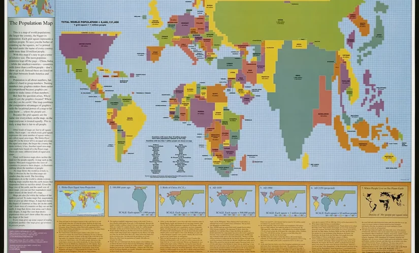
Peters Projection Maps by ODT, Inc.
In 2001, the TV show “The West Wing” featured a Peters Projection Map with the permission of ODT, Inc. and its founder Bob Abramms. At the time, ODT, Inc. provided innovative maps, products, and resources to help people see the world in a different way. Here is a clip of the scene in Season 2, Episode 16 of “The West Wing” that illustrates how striking and confusing a shift of perspective can be:
ODT, Inc. discontinued its business activity in 2021 due to the team’s retirement. However, the company’s maps following the Peters map projection, their Hobo-Dyer world map, and several other products are still available for purchase.
Related Posts